Whether you’re consuming art or making it, excellent photography is a few clicks away. Yet, there is friction when printing photographs, for both the photographer and the customer. The multiple variables of printing work aren’t easily understood and online resources are sparse.
Print House is an educational app for photographers, their customers, and any photography enthusiast. It’s also a service for photographers to showcase client galleries, and purchase prints. It was a challenge creating the same experience for photographers and their customers while giving the customers freedom to opt out of the learning aspect.
Problem: How do we make print photography education and printing photos easier?
Role: UX/UI Designer, UX Researcher
Responsibilities: User Research, personas, ideation, wireframes, brand platform, style guide, user testing, prototyping, high fidelity designs
Tools: Sketch, Figma, Miro, Google Forms, Google Meet
Constraints:
Research
I created a research plan, wrote a screener and identified five interview participants. Secondary research backed my hypothesis of the problem space:
it’s difficult to find comprehensive resources on printing,
most resources compare services, not printing variables,
if a print service compares variables, it’s to make a sale, not to educate.


I found that participants lack confidence when printing their work. A high-level of experience as a professional photographer has no impact on confidence; they still feel unsure at the multiple decision points required to print a photo. Yet, photographers must place emphasis on a grand experience for their customers. It feels disconnected from what they’re doing on the backend. Additionally, printing photos can feel like administrative work - an unpleasant job to be done.
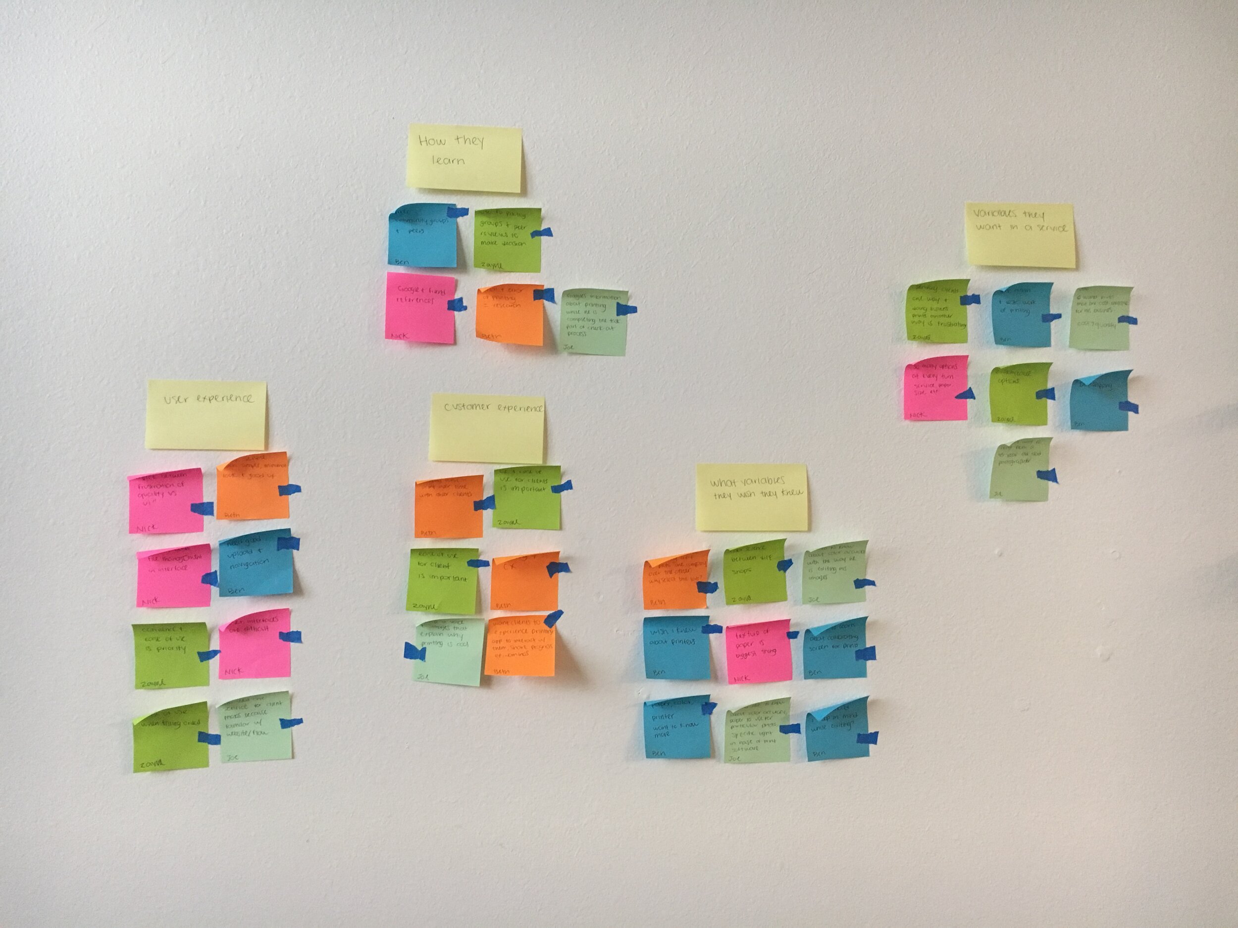
Creating Personas
I synthesized my user interviews using an affinity diagram, empathy maps and two personas. View research presentation.


HMW
After conducting research and synthesizing findings, I defined my design challenge based on a deeper understanding of my interviewers, their needs, and their most essential insights. View full HMW document.
How might we teach photographers about print variables?
How might we make printing enjoyable for photographers?
How might we align the photographer and customer/client experience?
User Stories
With the user stories created and prioritized, I started sketching out ideas.

Preliminary Site Map
The first site map was based off user goals and user stories, but my initial map wasn’t applicable to the application at large. Though I quickly ditched this first iteration, it was a great launchpad from user stories.

User Flows
From there, I sketched out user flows for three identified red routes (later transferred to Miro). View user flows in Miro.


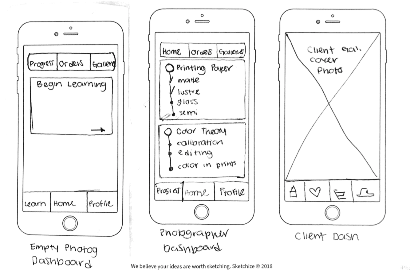
Red Route Sketches
Based on the user flows, I began sketching red routes screens.


Testing Early
Guerilla usability tests were conducted using POP by Marvel. Users understood the premise of the app, but found the proposed navigation and its language confusing. I reevaluated and adjusted my proposed information architecture a third time.
Design
With clarified information architecture it was time to create initial wireframes of user flows.
Wireframes and Wireflows
With so many possible actions on a few key screens, wireflows were made to clearly document the intended interactions, and guide future development.


Edge Case Evaluation
Most of the edge cases fell to the screen where users order prints. After the evaluation, I reduced the number of screens in the user flow by one.
Reworked this page to create a drop down feature. This eliminated the need for another page.
Added paper selection to the page so users can select multiple options of paper in one flow.
Made forward arrow icons to indicate a clear next step for users.
Made sure item picker has enough room for triple digits.

Brand Platform and Style Guide
A product packed with information should feel informative for users. As they learn, the information should be clear to read and navigate. With this, it should be easy to find and perform functions. The product is for learning, but it is also helping users print important photos of a user’s memories and/or of their work. With these important tasks in mind, the product should feel elevated but have a sense of care as users learn and perform tasks.


Accessibility Auditing Early
An accessibility audit was conducted before diving into high fidelity designs. The chosen colors had good contrast in grayscale, but the green looked dingy, and the light shade of pink was indistinguishable. So began my first of many rounds modifying my style guide.
View full accessibility audit.

High Fidelity Designs


Client View


Prototyping
Reflection
From this project, I learned to never be married to a vision or solution. I consider myself being experimentational, agile, and willing to compromise, but I was much more stuck on my vision of the solution and product than I realized. This persistence increased the time it took for me to ideate and make changes. Persistence on vision has its place, but it’s not in the early stages of UX design.