Free to Paid Conversion for Music Streaming App

A startup company launched a media product two years ago. It is a freemium model that has a mobile-web experience and a mobile app for both iOS and Android. The company’s business strategy was to first build a user base by offering a free product and then evolve the feature set so they could monetize on a premium (paid) product. At this point, the product has been well received and has a healthy user base of free users. 

Problem: The company needs to design an experience that will allow users to subscribe and pay a monthly fee. 

Constraints: It must be a mobile app. They want to charge a monthly fee for the resource. User tests must be remote. 

Role: UX/UI Designer, UX Researcher

Responsibilities: Research, Ideation, Wireframing, User Testing, Prototyping

Tools: Figma, Miro, Google Meet


Research First

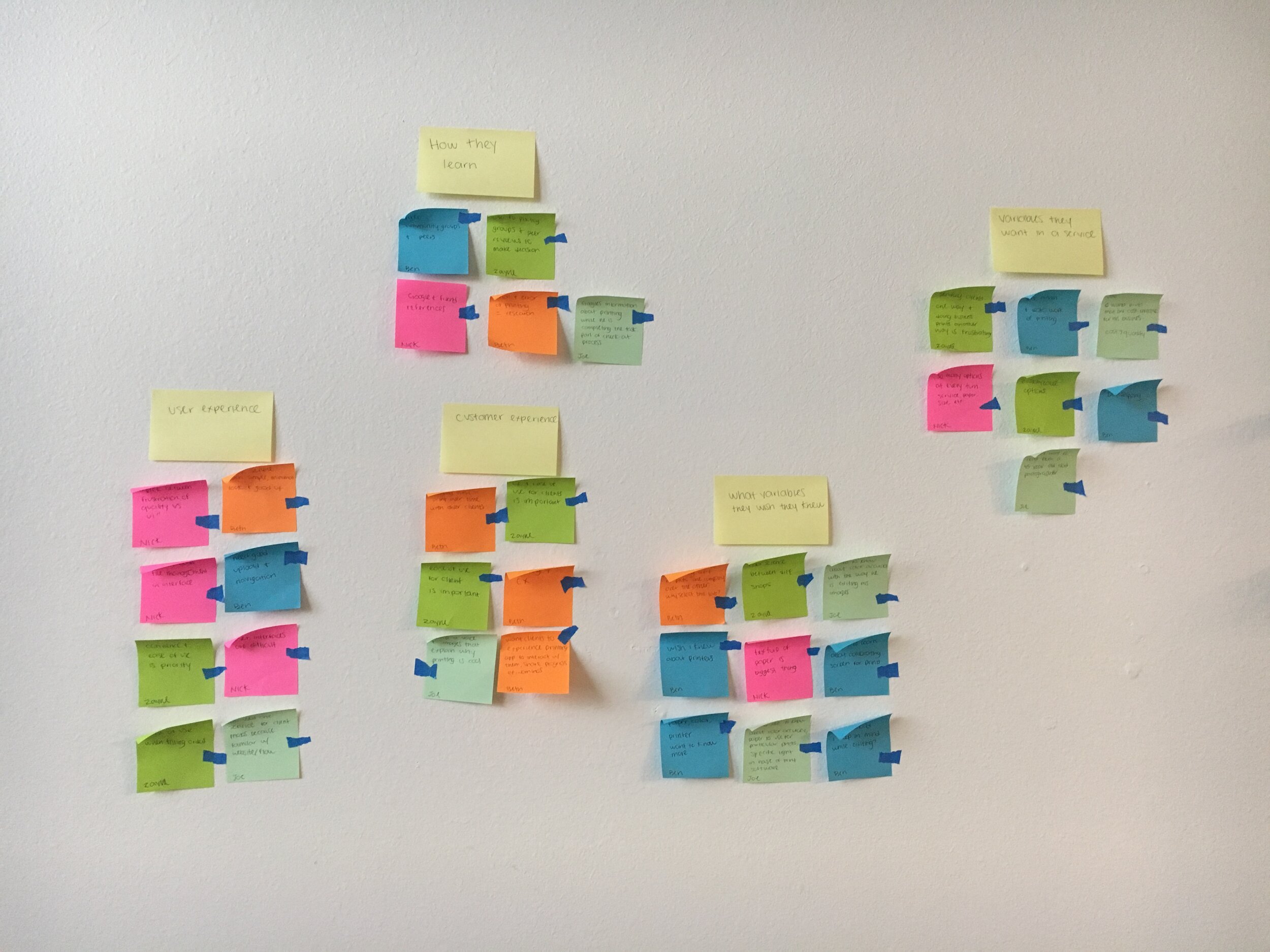
Before ideating my own solutions, I set out to do my own secondary and competitive research. 

Secondary Research 

Conversion of users is a common business goal, so secondary research was plentiful, and insightful. My key takeaways:

  1. Get your users to experience your product as soon as possible. Avoid tedious sign-up forms.

  2. The sooner a product can be personalized the better. The more personalized, the more invested in user feels. Gather data points early to customize their experience. This also helps with the third takeaway:

  3. Don’t let a user open a product to an empty screen. It’s a lot of cognitive load to imagine the possibilities. Provide information and examples to reduce load, and visualize the value of the product faster. 

  4. Before, during, and after a trial period is over, make converting to a premium user as easy as possible at all times. However, don’t make CTA’s intrusive, or aggressive. 

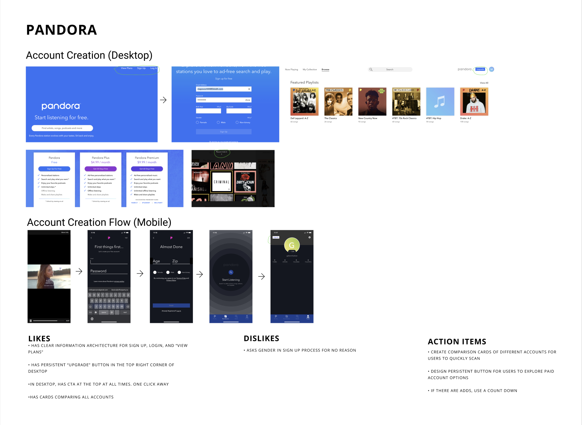
Competitive Research

With this knowledge in mind, I studied other profitable media companies’ solutions to convert free users. I looked at how industry experts approached similar problems and achieved similar business goals. 

I evaluated Youtube, Spotify, and Pandora. After reviewing established business solutions, I knew I wanted to incorporate comparison cards of different accounts types, and a persistent button for users to explore paid account options at any time. View industry leader evaluation.


User Personas

User personas weren’t provided, but the company provided a target user:

  • 18 - 24 years old 

  • Very tech-savvy — they are on their phones for several hours a day 

  • Very budget-conscious 

  • This type of media [music/movies/books] is a very important part of their lives

User Flows

With secondary and competitive research compiled, I began envisioning my own product solution. I sketched out three user flow scenarios for conversion:

  1. A new user subscribing to a premium account upon registration 

  2. A free user converted to a paid user during sign-in

  3. A free user converts to a paid user while using the product

Design

Brand Personality

The brand is uniquely diverse, but somehow always familiar. This creates the need for design to balance that tension. The brand’s attributes are bold, smart, and hip.  

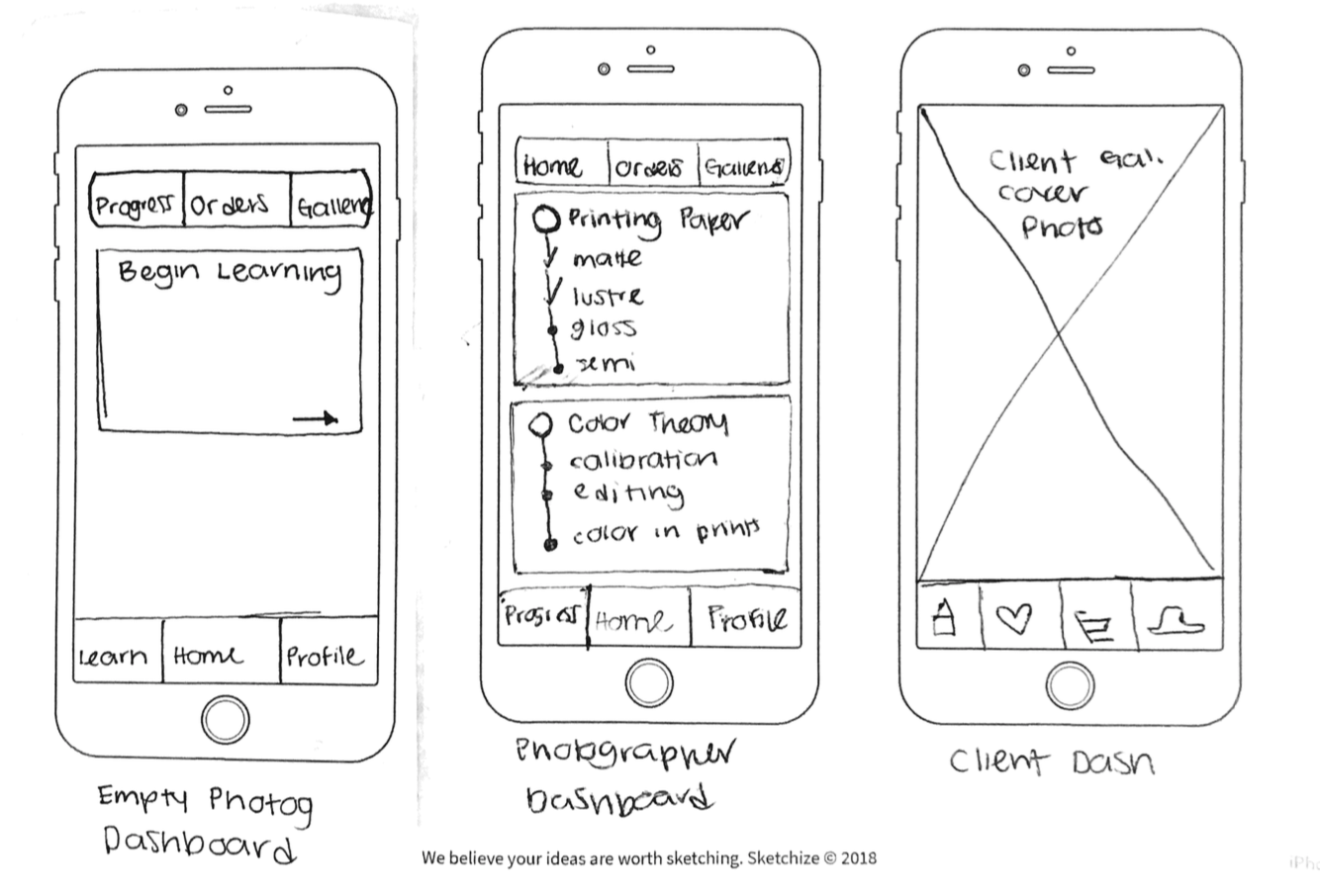
Low Fidelity Designs

I spent the following day creating wireframes of the user flows. View low-fidelity wireframes and prototype.

First Round Usability Tests

With a low-fidelity design and prototype in hand, I conducted five, remote usability tests. I had three key takeaways from usability testing.

  1. Label the steps in the account creation process.

    a. Users said they have more patience for filling out preferences when they knew the number of screens left. 

  2. Remove the step of adding credit card information in the sign-up flow.

    a. In my original design, users always had the option of skipping this step, but they still found the screen time-consuming and clunky. They didn’t feel enough value to give this information so soon. 

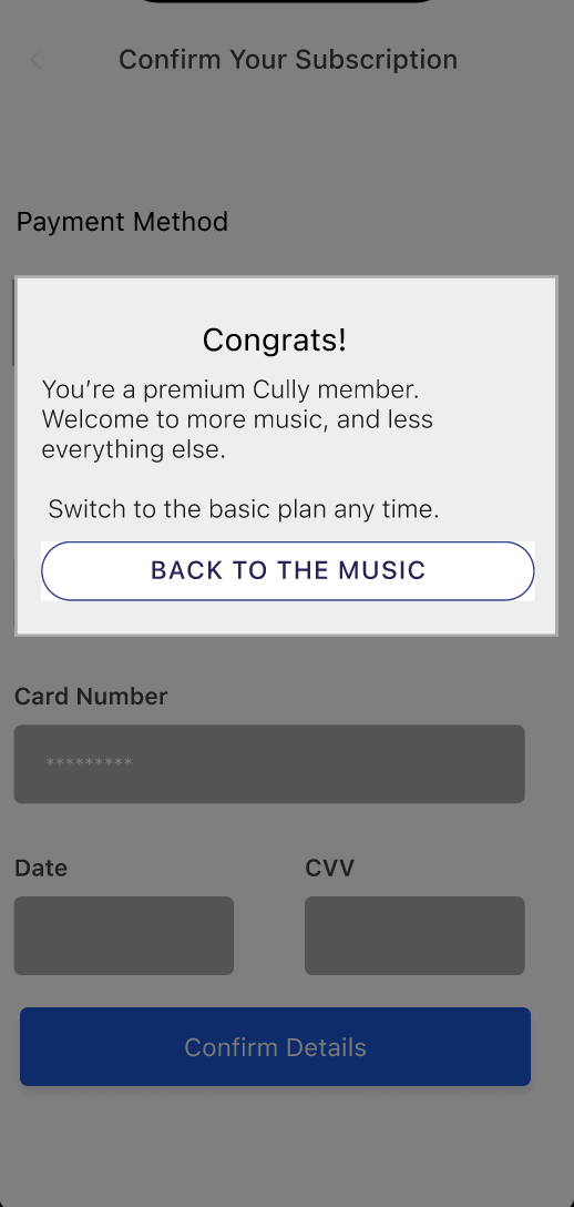
  3. There wasn’t enough feedback that a payment had taken place. 

    a. My initial design had the option to switch to a paid account with the click of a button (assuming the user decided to give credit card information at the start of a free trial). Users need more confirmation about their account upgrade and subsequent payment. 

View full usability report from low-fidelity designs. 

High Fidelity Designs

cully1.jpg
cully2.jpg


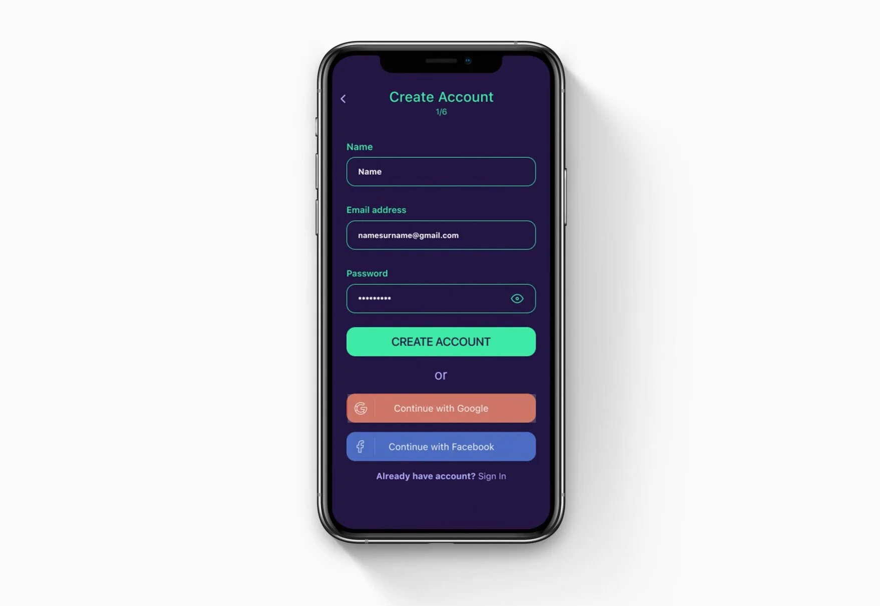
View high fidelity designs and prototype.

Second Round Usability Tests 

I conducted five additional remote interviews to test my high fidelity designs. Zero critical problems were found. There was one key finding from the second round of tests. After upgrading to a premium account, the premium menu icon persisted. This made users feel unsure if their upgrade was successful. I removed this menu icon and realigned the remaining navigational icons. 

UsabilityTestReport.png

Reflection 

I enjoyed the primary and secondary research so much throughout this process. There are so many strategies for user conversion, but many aren’t a happy, positive user experience. I enjoyed researching and designing effective, non-intrusive ways to convert free users to paid users. 

Next Steps 

I would next help plan campaigns to track data on user conversion rate. From there, I would learn which point is the most effective at user conversion, tweak the designs if needed, and present the successes to stakeholders. 

A modified Google design sprint

Post-Up wants to create a mobile app to make it easier for remote workers to find existing public spaces to work from. Remote workers are looking for places to be able to take calls, have quick meetings, and do work in a quiet space. Post-Up wants to charge a monthly fee in exchange for this resource. 

Problem: Existing directories of public spaces are a search away, but they’re designed to help users find dining options, not if it’s a good place to sit down and work. Remote workers must search through multiple customer reviews to gain insight on if it’s a good place to work.

Constraints: It must be a mobile app. They want to charge a monthly fee for the resource. User tests must be remote. 

Role: UX/UI Designer, UX Researcher

Responsibilities: Research, User Testing, Ideation, Wireframing, Prototyping

Tools: Figma, Google Meet

Day 1 - Understand and Map 

I began the sprint by mapping three potential user flows and experiences for the app.  Each flow is fairly similar. I decided it’s possible to accommodate each of these flows in my designs. 

  1. Types zip code, city, or neighborhood - scans results - selects potential location - reviews photos - reviews amenities - reviews type and number of seating - copies address - opens map - end 

  2. Scans results near me - selects potential location - reviews photos - reviews other remote worker reviews - views location in map - copy address - end

  3. Opens map view with current location - scans map  - selects potential location - reviews amenities - reviews photos - shares with client - copy address - end

Day 1 Map (1).jpg

Day 2 - Sketching 

I spent a portion of the second day looking at related competitor products. I found key features in each of them to inspire my own sketches.

Lightning Demos 


Yelp 

Yelp clearly shows the walking distance to a location. They also have a review of the day fdeature, which is great for users to get a feel for the busy-ness and vibe of the location that day. 

Nomad Space

Nomad space highlights top-rated workspaces on their home/explore page. They also highlight workspaces in a particular city well. Though the listings are paid in this example, they could be filtered by top-rated by city. 

Google Search

Google does a nice job of giving the details up front, so a user knows about the shop at a glance, instead of having to click. Google also does a nice job of sharing amenities. Additionally, they create helpful categories for users like atmosphere, crowd (types of people), and social profiles in case someone wants to view more photos than Google has available. 

Laptop Friendly                                                          

This app has a nice map feature. It’s also a nice prompt in the search bar for users to type in a specific cafe instead of only a location. 

Moving Nomads    

The tips feed in the navigation is a nice idea for users to quickly crowdsource and read reviews for the best spots. Users can also vote up reviews, which filters the most helpful comments.            

Sketches 

Crazy 8 Exercise

I decided the most important screen is the one containing location results for users to scan and determine which location they’d like to take a closer look at. I believe this screen will be the most utilized. 

During a user interview, one user said they click in and review at least 3-4 places before making a decision. If the results screen provides a clear summary of the location, it can reduce time searching and the need to drill down into results as often. 

Crazy8.jpg

Solution Sketch

I decided the most important screen contains location results. On this screen, users can scan and decide which spot to take a closer look. I believe this screen will be the most utilized as users make the decision on where to work for the day.

Solution Sketch.jpg

Day 3 - Storyboarding

I proceeded with the solution screen below because it conveyed the most scannable, digestible information on one screen. I created the second screen in the panel to mirror a similar solution sketched during crazy 8’s.

I added three additional screens to my storyboard, for a total of five screens. 

I sketched out a filter modal for an option to filter user search. I also sketched out a Review screen and an Amenities screen. 

Storyboard Sketch 2.jpg
Storyboard Sketch 1.jpg

Day 4 - Prototyping

I used a lo-fi wireframe kit to design an 8-screen prototype in Figma. The prototyping process helps me clarify my sketches and create a foundation for moving forward. Testing my prototype with users, I hope to add key items to this foundation, and take it to the next level. I love the aha moments when testing designs with users. View prototype in Figma. 

Whatever it is, the way you tell your story online can make all the difference.

Day 5 - Testing

I remotely interviewed five users to test my prototype. Each user understood the purpose and function of the app when clicking through the prototype. I found two main takeaways while talking with users. 

  1. There was a slight functionality issue. Each user paused after selecting criteria. They weren’t sure what to do next. To fix this, in addition to generating results when clicking outside of the criteria box, I added a “find my workspace” button. This provides a clear next step to users and reinforces the intent of the app. 

  2. Users requested more features and detail when describing amenities. I added details like a phone number, menu, and crowd size. I also traded the word “cozy” for “small space” and added words like plants, loud, cozy, etc. to describe the space. 

Screen Shot 2021-05-10 at 8.18.55 PM.png

Reflection 

I’m really glad I made the choice to use a lo-fi wireframe kit to prototype and test my designs. It was fun and rewarding to get feedback on a prototype so quickly. It is a challenge for me to spend a short amount of time designing a prototype. I was tempted to add more screens. But once testing began, I realized, as always,  there are plenty of findings to learn from users from even the simplest of designed solutions. The reward from testing early saves time in the long run, and lets designers know exactly what to spend their time on in the next iteration.    

Next Steps 

I would love to see this out to high-fidelity designs. Next, decide when the app has provided a solid preview of value to the user to prompt creating an account, and going through the monthly subscription flow. 

Digitizing knowledge of print photography in a mobile app

Whether you’re consuming art or making it, excellent photography is a few clicks away. Yet, there is friction when printing photographs, for both the photographer and the customer. The multiple variables of printing work aren’t easily understood and online resources are sparse.

Print House is an educational app for photographers, their customers, and any photography enthusiast. It’s also a service for photographers to showcase client galleries, and purchase prints. It was a challenge creating the same experience for photographers and their customers while giving the customers freedom to opt out of the learning aspect.  

Problem: How do we make print photography education and printing photos easier?

Role: UX/UI Designer, UX Researcher

Responsibilities: User Research, personas, ideation, wireframes, brand platform, style guide, user testing, prototyping, high fidelity designs

Tools: Sketch, Figma, Miro, Google Forms, Google Meet

Constraints:

Research 

I created a research plan, wrote a screener and identified five interview participants. Secondary research backed my hypothesis of the problem space:

  • it’s difficult to find comprehensive resources on printing, 

  • most resources compare services, not printing variables,

  • if a print service compares variables, it’s to make a sale, not to educate.  

Screen Shot 2020-09-18 at 10.22.15 AM.png
Screen Shot 2020-09-18 at 10.23.02 AM.png

I found that participants lack confidence when printing their work. A high-level of experience as a professional photographer has no impact on confidence; they still feel unsure at the multiple decision points required to print a photo. Yet, photographers must place emphasis on a grand experience for their customers. It feels disconnected from what they’re doing on the backend. Additionally, printing photos can feel like administrative work -  an unpleasant job to be done. 


Creating Personas

I synthesized my user interviews using an affinity diagram, empathy maps and two personas. View research presentation.


HMW

After conducting research and synthesizing findings, I defined my design challenge based on a deeper understanding of my interviewers, their needs, and their most essential insights. View full HMW document.

How might we teach photographers about print variables?

How might we make printing enjoyable for photographers?

How might we align the photographer and customer/client experience?

User Stories

With the user stories created and prioritized, I started sketching out ideas.

Screen Shot 2020-09-17 at 11.54.27 PM.png

Preliminary Site Map

The first site map was based off user goals and user stories, but my initial map wasn’t applicable to the application at large. Though I quickly ditched this first iteration, it was a great launchpad from user stories.

 
Screen Shot 2020-09-18 at 3.20.08 AM.png
 

User Flows

From there, I sketched out user flows for three identified red routes (later transferred to Miro). View user flows in Miro.

Capstone User Flows - Ordering Prints.jpg
Capstone User Flows - Account Creation_Sign In.jpg
Capstone User Flows - Photographer Flow for Color Calibration.jpg

Red Route Sketches

Based on the user flows, I began sketching red routes screens. 

Testing Early

Guerilla usability tests were conducted using POP by Marvel. Users understood the premise of the app, but found the proposed navigation and its language confusing. I reevaluated and adjusted my proposed information architecture a third time.


Design

With clarified information architecture it was time to create initial wireframes of user flows.

Wireframes and Wireflows

With so many possible actions on a few key screens, wireflows were made to clearly document the intended interactions, and guide future development. 

Edge Case Evaluation

Most of the edge cases fell to the screen where users order prints. After the evaluation, I reduced the number of screens in the user flow by one.


  • Reworked this page to create a drop down feature. This eliminated the need for another page.

  • Added paper selection to the page so users can select multiple options of paper in one flow.

  • Made forward arrow icons to indicate a clear next step for users.

  • Made sure item picker has enough room for triple digits.

Screen Shot 2020-09-18 at 3.42.05 AM.png
 

Brand Platform and Style Guide

A product packed with information should feel informative for users. As they learn, the information should be clear to read and navigate. With this, it should be easy to find and perform functions. The product is for learning, but it is also helping users print important photos of a user’s memories and/or of their work. With these important tasks in mind, the product should feel elevated but have a sense of care as users learn and perform tasks.

Accessibility Auditing Early

An accessibility audit was conducted before diving into high fidelity designs. The chosen colors had good contrast in grayscale, but the green looked dingy, and the light shade of pink was indistinguishable. So began my first of many rounds modifying my style guide.
View full accessibility audit.

 
Screen Shot 2020-09-18 at 10.07.19 AM.png


High Fidelity Designs

HiFi Sign In.png
HiFi Account Type.png
HiFi Account Creation.png
HiFi Account Info.png
HiFi Welcome Back.png
Photographer Empty Dashboard.png
Photo Upload Screen.png
 

Client View

HiFi Client Gallery Dashboard.png
Order.png
HiFi Client Gallery View.png
HiFi Select Photo Size.png
HiFi Select Print.png

Prototyping

Reflection

From this project, I learned to never be married to a vision or solution. I consider myself being experimentational, agile, and willing to compromise, but I was much more stuck on my vision of the solution and product than I realized. This persistence increased the time it took for me to ideate and make changes. Persistence on vision has its place, but it’s not in the early stages of UX design.